Superbird
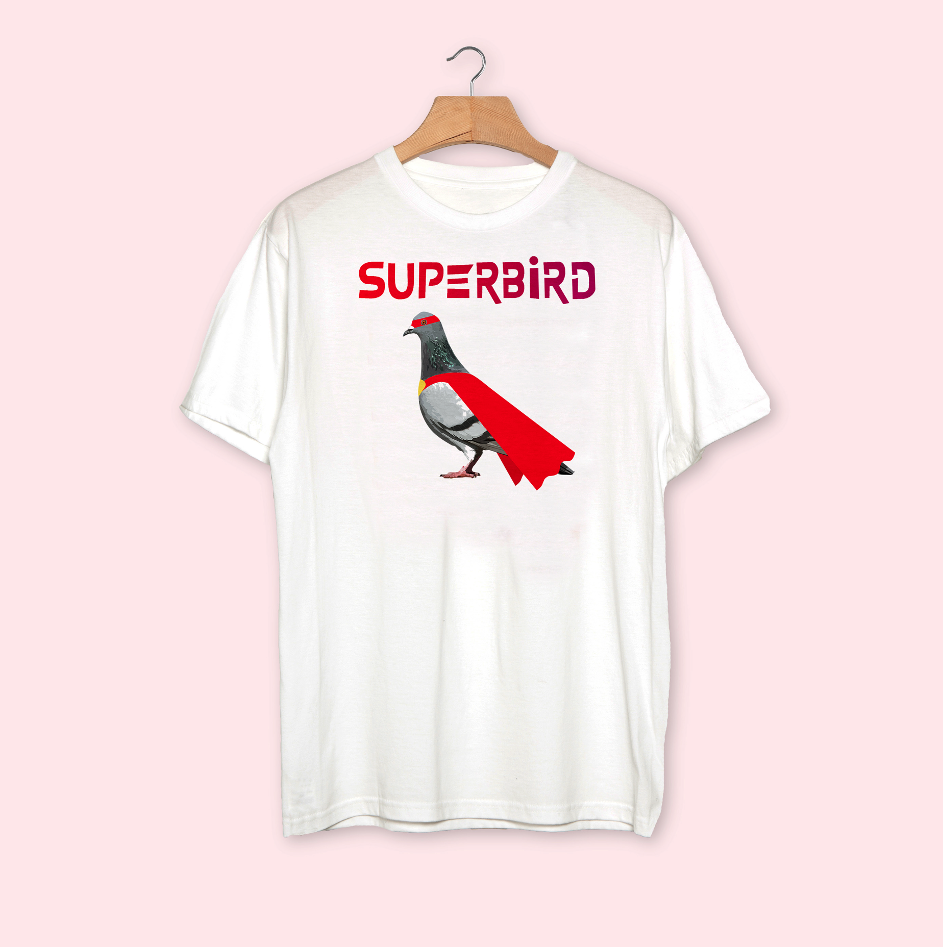
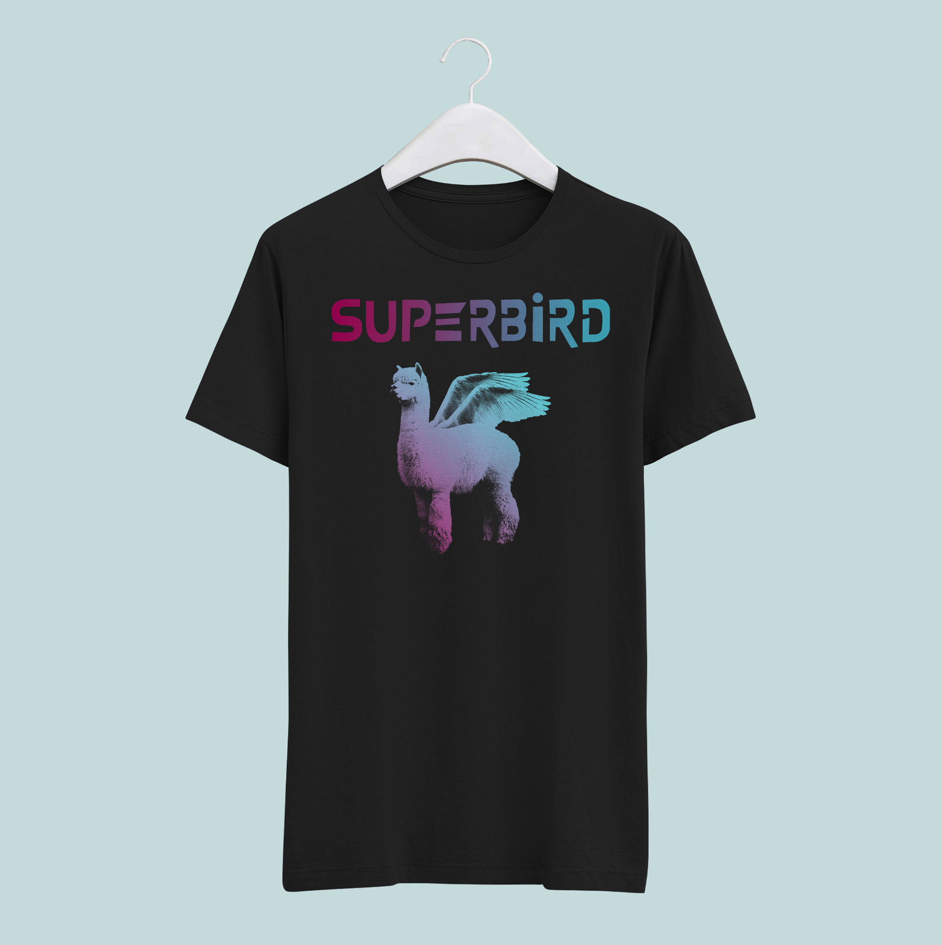
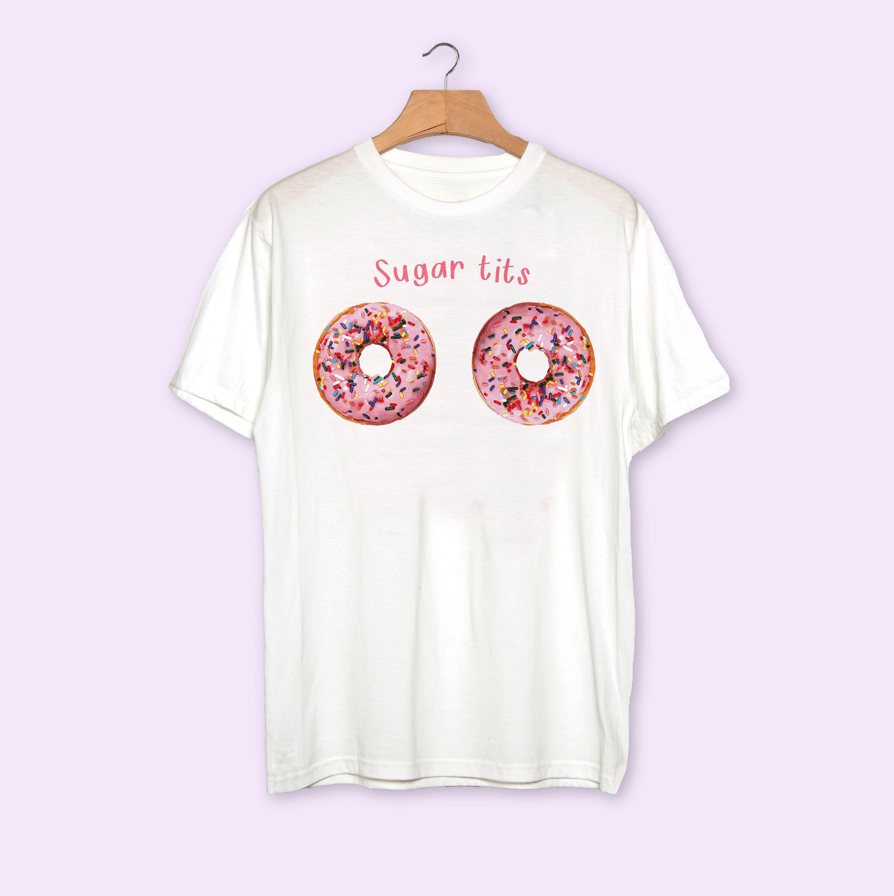
Superbird are a London-based band that I have worked with closely since they launched in 2017. I have solely managed the band’s creative materials including their brand identity, website and merchendise.


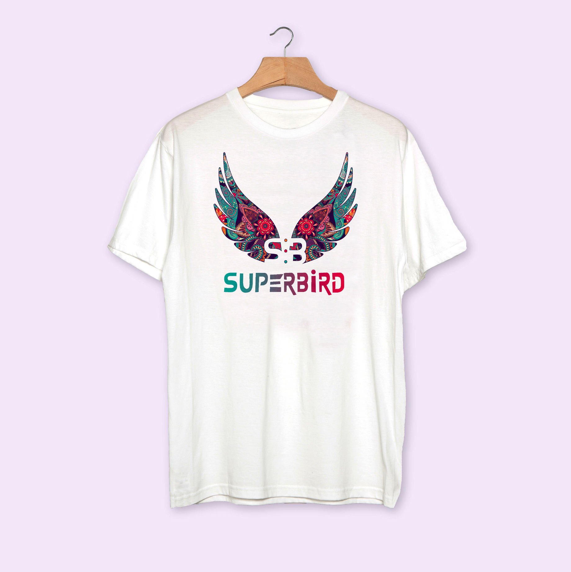
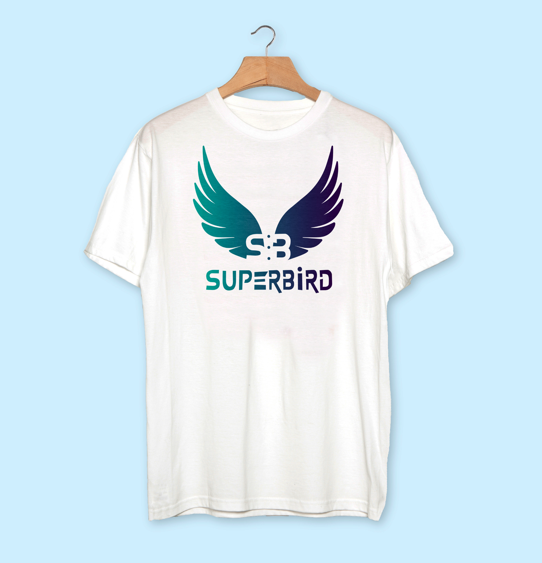
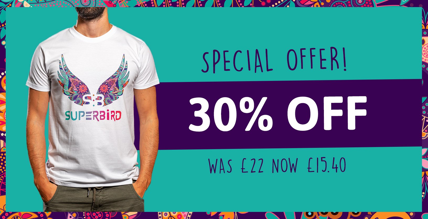
Superbird are a pop-funk band whose statement is to ‘inject colour into the world’. We came up with the paisley branding along side the wings to represent flying high with colour. They wanted to be colourful but still sophisticated as their sound can be very experimental and technical. They are also heavily influenced by Prince, so we used the purple colour as a nod to this. Showing they are a three piece band was important to them, so we added the 3 dots in the wings and the 3 lines for the E to represent each member.


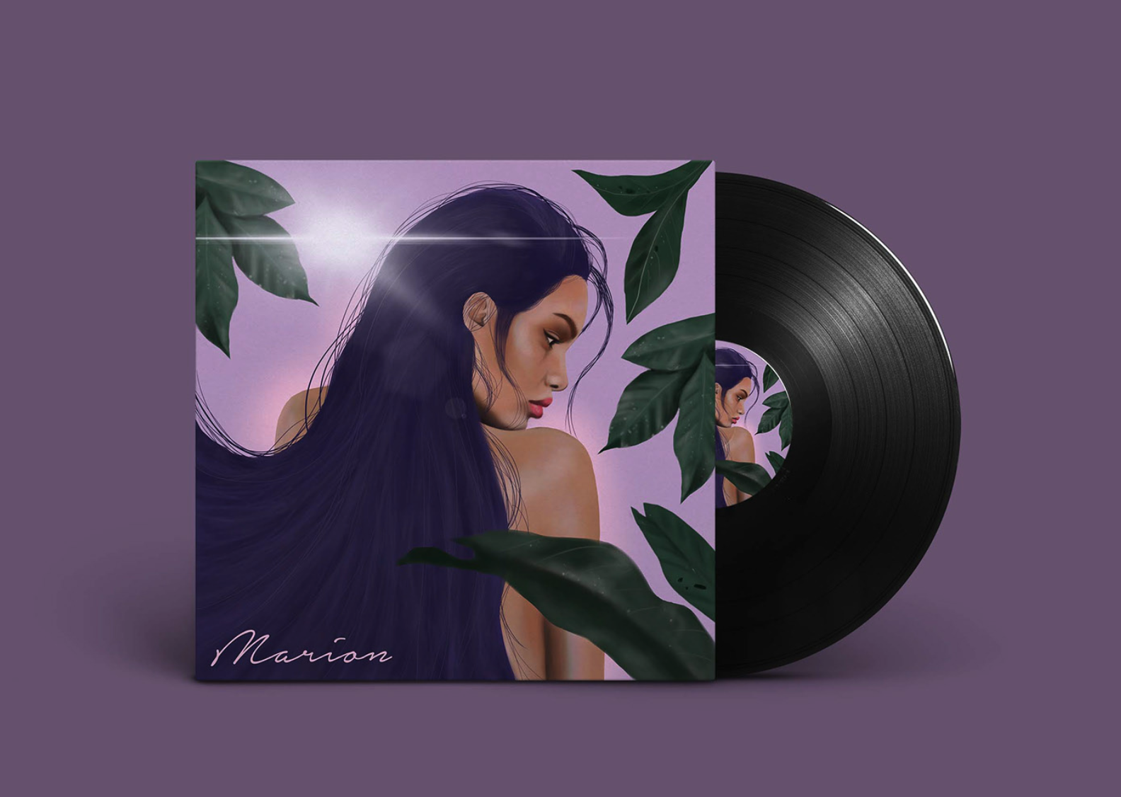
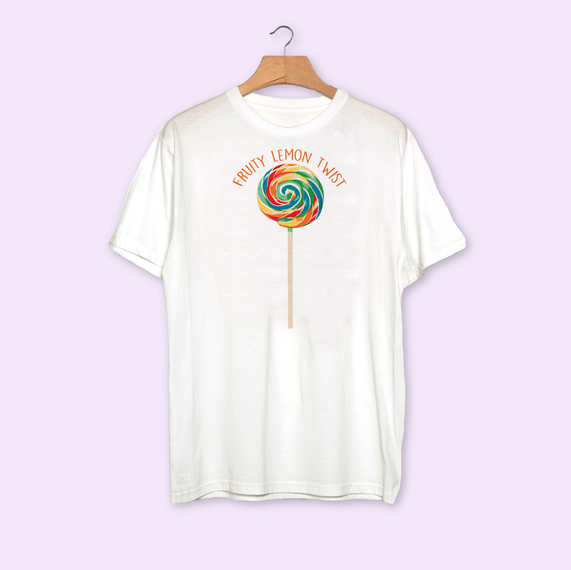
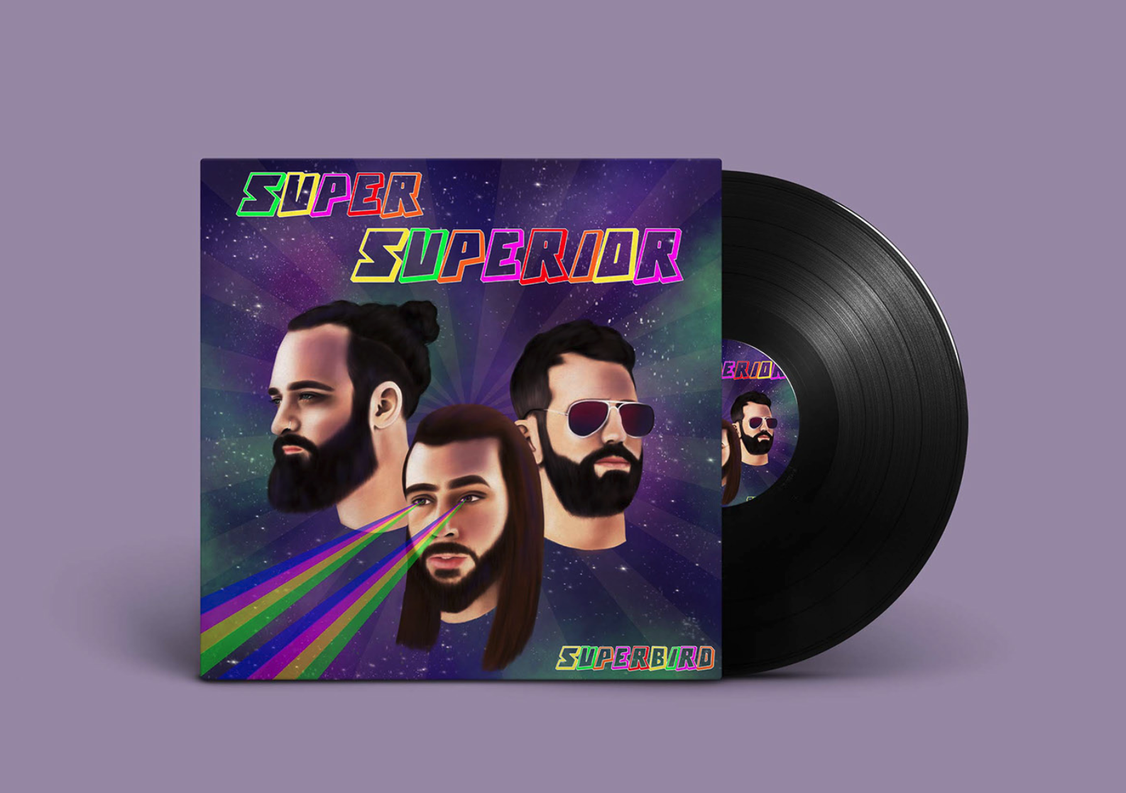
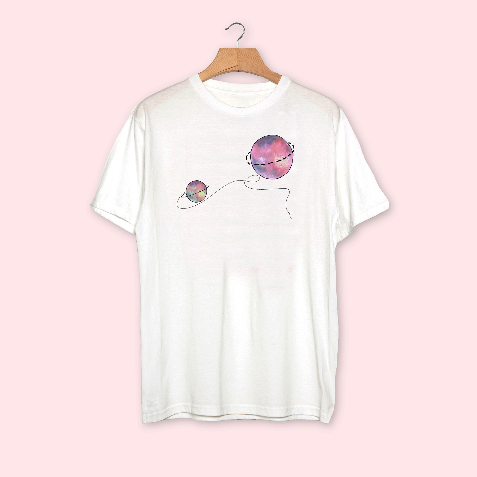
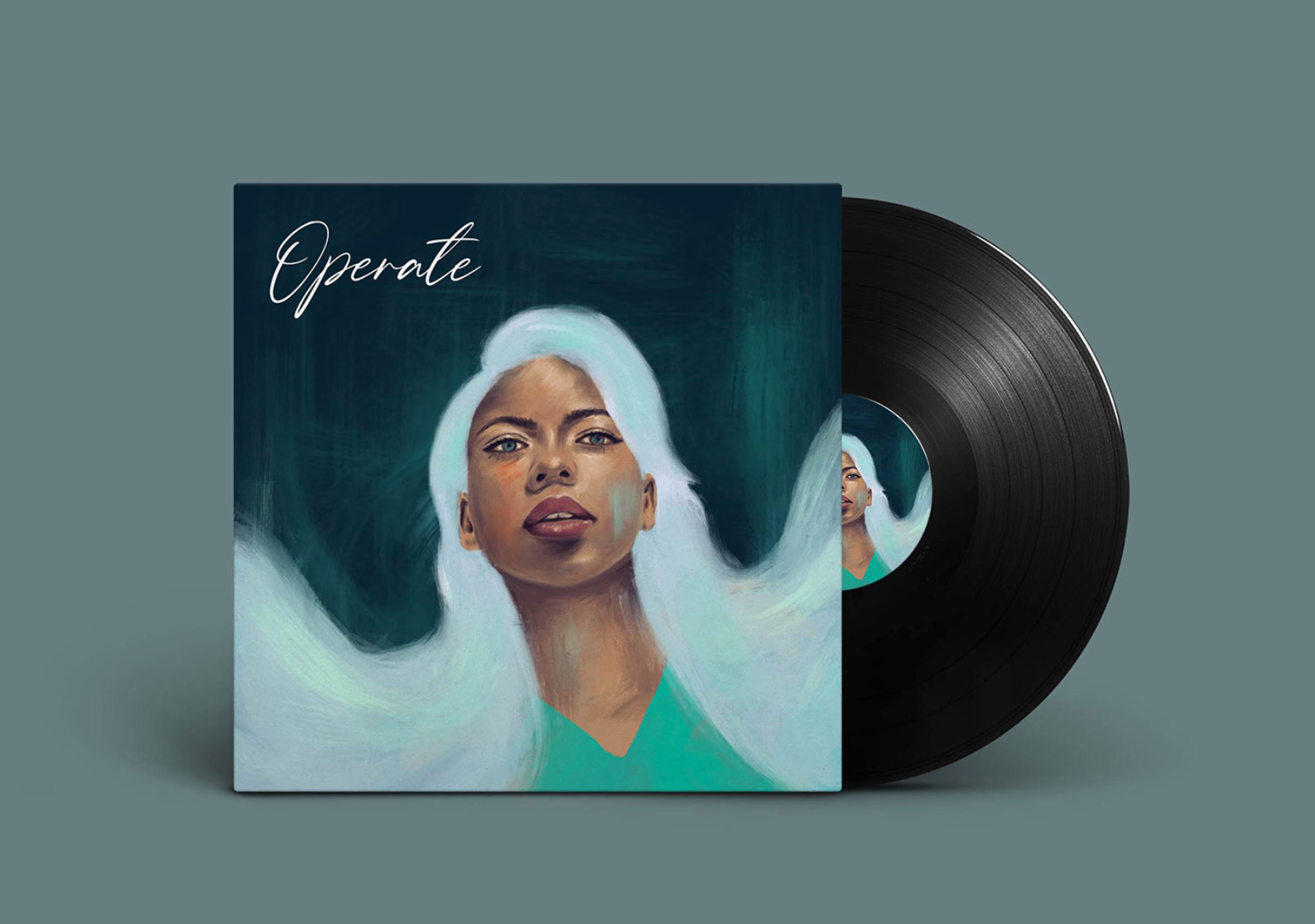
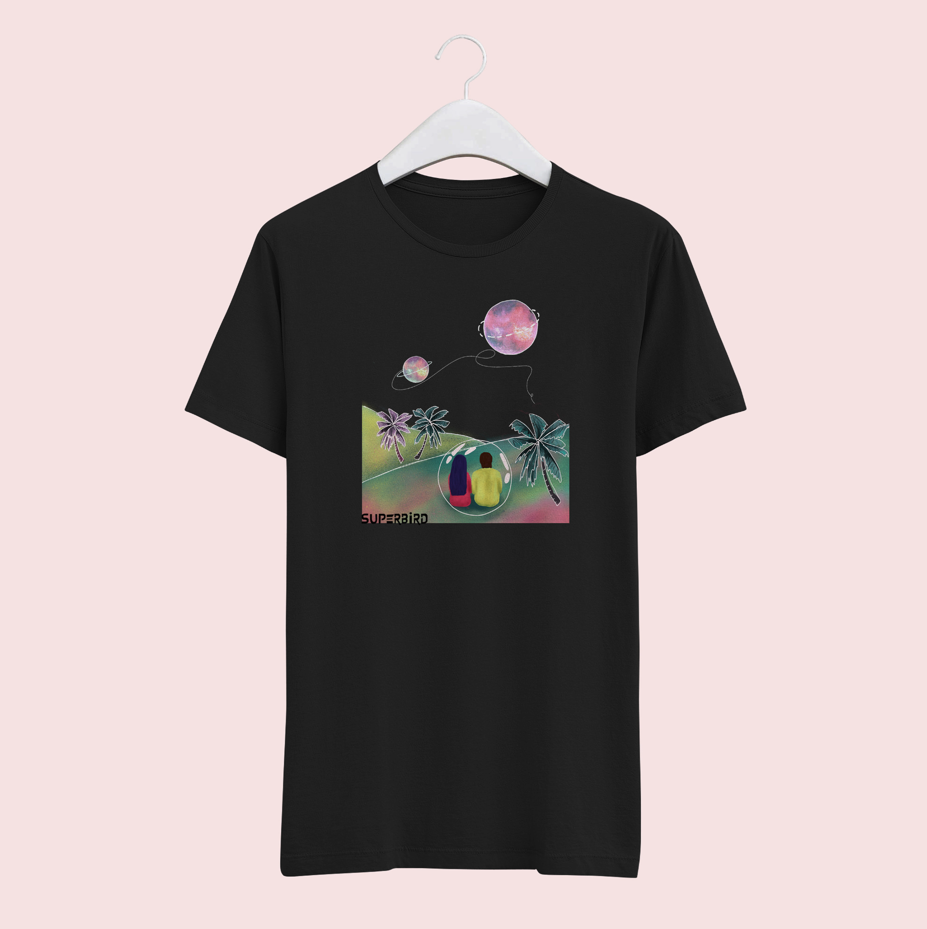
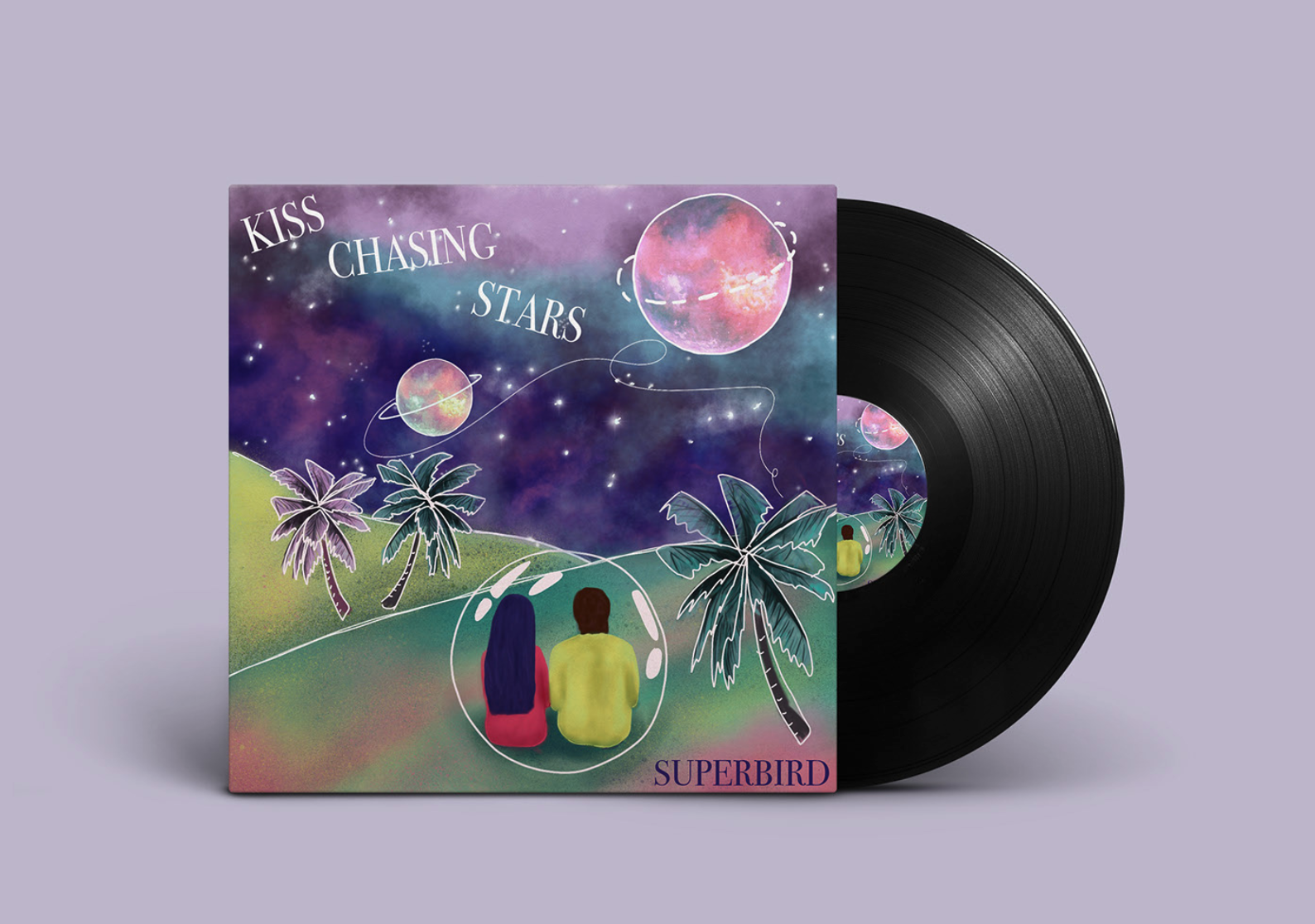
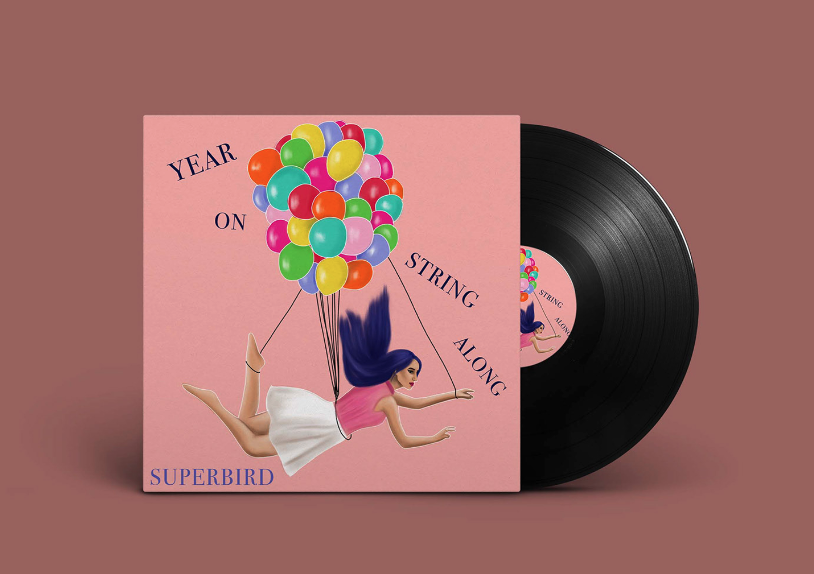
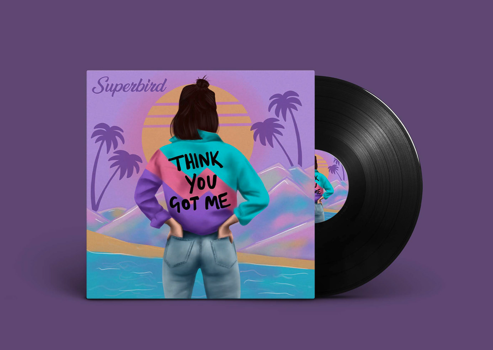
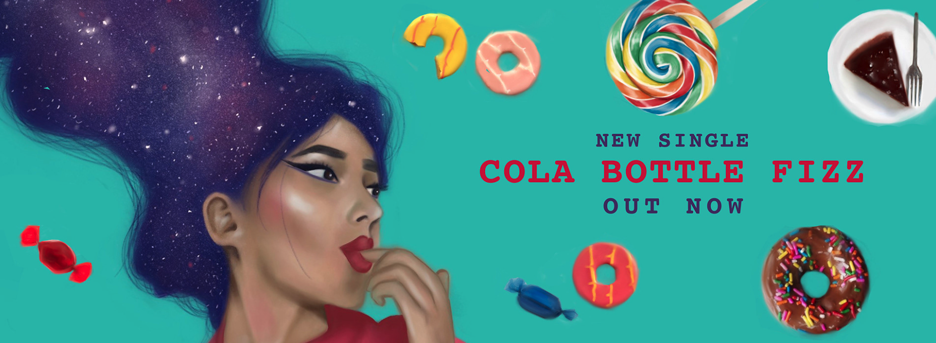
I designed the website using Adobe XD and developed it using WIX. I manage and maintain the website and the merchendise store including orders and stock. As well as the merch, I design and illustrate all of the album artwork and create assets for social media compaigns and channels.
